

I like monitoring stuff. That’s what I do at work and when my home ISP started giving me random problems I decided it would be nice to monitor my home network as well.
There are a couple of ways to go about this. A very popular and open source solution is SmokePing, which is written in Perl and is used to visualize network latencies. It’s a great solution, but for my current stack, which involves Prometheus and Grafana, it meant I had to deploy a standalone tool separate from my monitoring stack — something that I wanted to avoid.
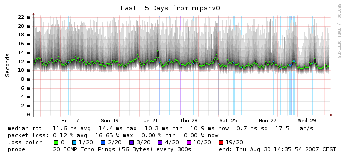
So, I looked for other solutions and luckily happened to stumble upon oddtazz in one of the common Telegram groups where he shared his solution for the above: Telegraf ICMP plugin and Grafana. This is exactly what I’ve been looking for but for some reason, I had wrongly assumed Telegraf needs InfluxDB to store the data. After Googling a bit more, I found Telegraf supports the Prometheus format (among a huge list of others!) but this wasn’t clear from their documents.
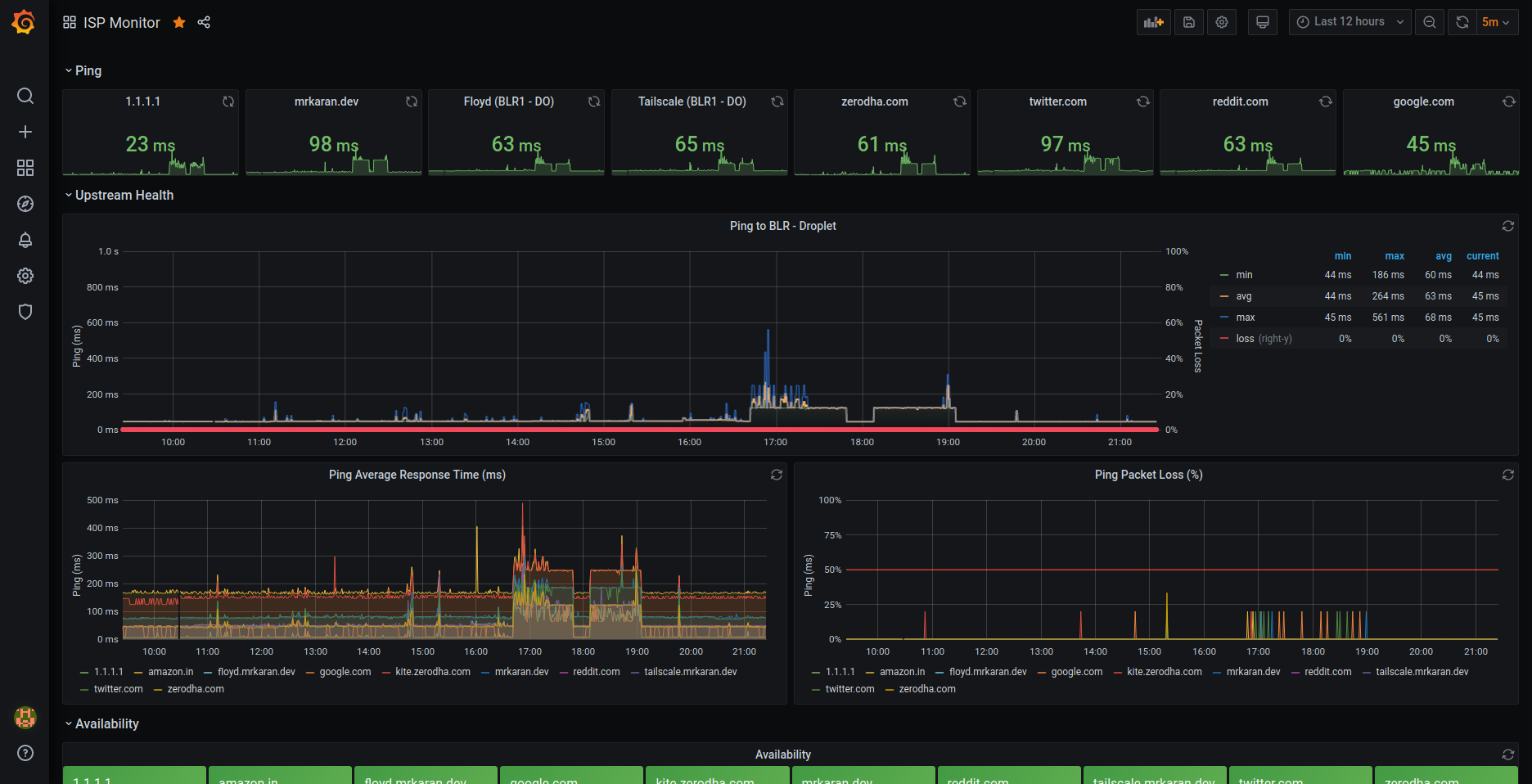
I decided to run a Telegraf agent in my RPi connected to my home router over LAN, scrape metrics using Prometheus, and visualise graphs in Grafana! For the non-patient readers, here’s what my dashboard looks like!:
Setup
To get started, we need to download Telegraf and configure the Ping plugin. Telegraf uses plugins for input, output, aggregating and processing. What this basically means is that you can configure multiple input plugins like DNS, ICMP, and HTTP and export the data of these plugins in a format of your choice with Output plugins.
This makes Telegraf extremely extensible; you could write a plugin (in Go) of your choice if you fancy that as well!
Here’s what my telegraf.conf looks like:
# Input plugins

# Ping plugin
[[inputs.ping]]
urls = ["mrkaran.dev", "tailscale.mrkaran.dev", "floyd.mrkaran.dev", "1.1.1.1", "kite.zerodha.com", "google.com", "reddit.com", "twitter.com", "amazon.in", "zerodha.com"]
count = 4
ping_interval = 1.0
timeout = 2.0

# DNS plugin
[[inputs.dns_query]]
  servers = ["100.101.134.59"]
  domains = ["mrkaran.dev", "tailscale.mrkaran.dev", "floyd.mrkaran.dev", "1.1.1.1", "kite.zerodha.com", "google.com", "reddit.com", "twitter.com", "amazon.in", "zerodha.com"]

# Output format plugins
[[outputs.prometheus_client]]
  listen = ":9283"
  metric_version = 2
Firstly, it’s so nice to see an Ops tool not using YAML. Kudos to Telegraf for that. I’d love to see other tools follow suit.
Getting back to the configuration part, input.plugin is a list of plugins that can be configured and I have configured the Ping and DNS plugins in my config. The output is in Prometheus format so it can be scraped and ingested by Prometheus’ time-series DB.
Running Telegraf
With the above config in place, let’s try running the agent and see what metrics we get. I am using the official Docker image to run the agent with the following config:
docker run --name telegraf-agent --restart always -d -p 9283:9283 -v $PWD/telegraf.conf:/etc/telegraf/telegraf.conf:ro telegrafAfter running the above command, you should be able to see the metrics at localhost:9283/metrics.
$ curl localhost:9283/metrics | head
  % Total    % Received % Xferd  Average Speed   Time    Time     Time  Current
                                 Dload  Upload   Total   Spent    Left  Speed
  0     0    0     0    0     0      0      0 --:--:-- --:--:-- --:--:--     0# HELP dns_query_query_time_ms Telegraf collected metric
# TYPE dns_query_query_time_ms untyped
dns_query_query_time_ms{dc="floyd",domain="amazon.in",host="work",rack="work",rcode="NOERROR",record_type="NS",result="success",server="100.101.134.59"} 124.096472
dns_query_query_time_ms{dc="floyd",domain="google.com",host="work",rack="work",rcode="NOERROR",record_type="NS",result="success",server="100.101.134.59"} 136.793673
dns_query_query_time_ms{dc="floyd",domain="kite.zerodha.com",host="work",rack="work",rcode="NOERROR",record_type="NS",result="success",server="100.101.134.59"} 122.780946
dns_query_query_time_ms{dc="floyd",domain="mrkaran.dev",host="work",rack="work",rcode="NOERROR",record_type="NS",result="success",server="100.101.134.59"} 137.915851
dns_query_query_time_ms{dc="floyd",domain="twitter.com",host="work",rack="work",rcode="NOERROR",record_type="NS",result="success",server="100.101.134.59"} 111.097483
Perfect! Now, we’re all set to configure Prometheus to scrape the metrics from this target. In order to do that you need to add a new job:
- job_name: "ispmonitor"
  scrape_interval: 60s
  static_configs:
    - targets: ["100.94.241.54:9283"] # RPi telegraf Agent
In the above config, I am plugging my Tailscale IP assigned to my Raspberry Pi on the port where the Telegraf agent is bound. This is one of the many reasons why Tailscale is so bloody awesome! I can connect different components in my network to each other without setting up any particular firewall rules, exposing ports on a case-by-case basis.
Sidenote: If you haven’t read Tailscale’s amazing NAT Traversal blog post, do yourself a favour and check it out after you finish reading this one of course!
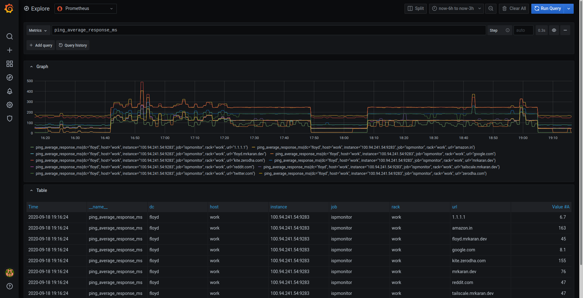
Anyway, coming back to our Prometheus setup, we can see the metrics being ingested in Figure 4.
Show me the graphs
Now comes the exciting bit — making pretty graphs. First, let’s discuss what’s the most important data I can extract out of Ping and DNS plugins. These plugins export a decent amount of data, but a good rule of thumb while making dashboards is to optimize signal vs noise ratio. We’ll do that by filtering out only the metrics that we care for.
Let’s check all the metrics exported by the Ping plugin:
$ curl localhost:9283/metrics | grep ping | grep TYPE
# TYPE ping_average_response_ms untyped
# TYPE ping_maximum_response_ms untyped
# TYPE ping_minimum_response_ms untyped
# TYPE ping_packets_received untyped
# TYPE ping_packets_transmitted untyped
# TYPE ping_percent_packet_loss untyped
# TYPE ping_result_code untyped
# TYPE ping_standard_deviation_ms untyped
# TYPE ping_ttl untyped
Perfect! So, from the above list of metrics, the most important ones for us are:
ping_average_response_ms: Avg RTT for a packetping_maximum_response_ms: Max RTT for a packetping_percent_packet_loss: % of packets lost on the way
With just the above three metrics, we can answer questions like:
- Is my ISP suffering an outage?
If yes, ping_percent_packet_loss should be unusually higher than normal. This usually happens when the ISP has routing that is borked, which causes the packet to be routed in a less optimized way. As a side effect, packet loss becomes one of the key metrics to measure here.
- Is the upstream down?
If yes, ping_average_response_ms over a recent window should be higher than a window compared to a previous time range when things were fine and dandy. This can mean two things — either your ISP isn’t routing correctly to the said upstream or the CDN/Region where your upstream is located, is facing an outage. This is quite a handy metric for me to monitor!
How many times have your friends complained “xyz.com isn’t working for me” and when you try to load, it’s fine from your end? There are a lot of actors at play but ping is usually the simplest and quickest way to detect whether an issue persists or not. Of course, this doesn’t work for hosts that block ICMP packets altogether. They are not rare either, netflix.com and github.com both block ICMP probes for example. For my use case, this wasn’t a major issue as I was able to still probe a decent amount of upstreams all over the world.
With that out of the way, let’s break the dashboard into different components and see what goes behind them.
Ping response panel

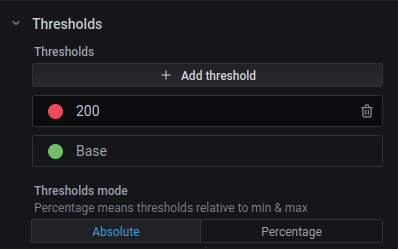
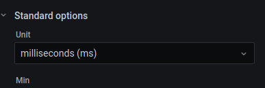
To plot this, simply choose a Stat visualization with the query ping_average_response_ms{url="$url"}. Repeat this panel for the variable $url and you should be able to generate a nice row view like this.
Additionally, you can choose thresholds and the unit to be displayed in the panel with these options.
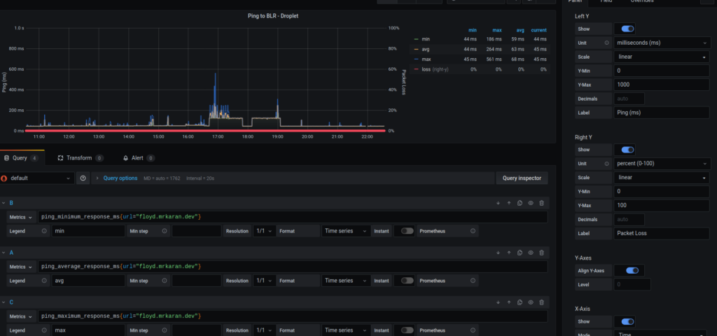
Ping response time graph
The next graph is interesting. It lets me visualize the average, minimum, and maximum ping response time as well as the % packet loss plotted on the Y2 (right Y) axis.
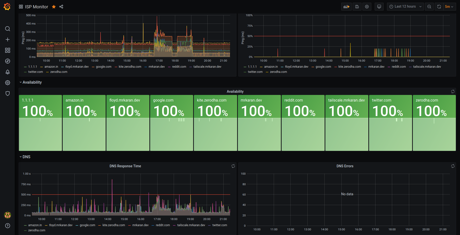
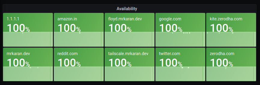
Availability panel
An interesting query to calculate uptime (just in the context of whether the upstream is reachable) is:
100 - avg_over_time(ping_percent_packet_loss[2m])Since I scrape metrics at an interval of 1m (in order to not ping too frequently and disrupt my actual browsing experience), in this query, I am averaging the data points for the metric ping_percent_packet_loss in a [2m] window.
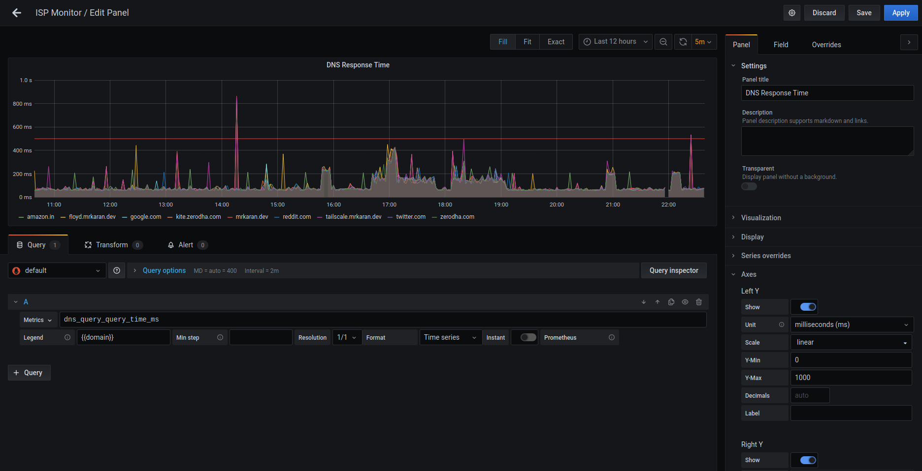
DNS response time graph
We can similarly query the DNS response time by visualizing the average response time for a DNS query. This might be useful only to people self-hosting their DNS servers.
Conclusion
So, with a pretty simple and minimal open source solution, I was able to set up monitoring for my home network! Over the last few days whenever my ISP had an issue, I could correlate it with my metrics! I still can’t do anything about it though, because of that quintessential solution to all tech problems, ‘Did you try rebooting your router’ from the ISP’s customer support.
Shoot me any questions on my Twitter @mrkaran_ 🙂
Karan’s work at Zerodha focuses on backend engineering with a dash of DevOps. He likes to tinker with monitoring, networking, and distributed systems.
Adapted from the original post at mrkaran.dev.
The views expressed by the authors of this blog are their own and do not necessarily reflect the views of APNIC. Please note a Code of Conduct applies to this blog.