
It is well and truly the season for reviewing the year that has been. While 2018 has no doubt been another big year in the world of the Internet, it often pays to look at how it compares to previous years to understand and forecast growth or decline trends.
Since 2013, we at the SmartData@Polito lab, Politecnico di Torino, have been conducting a large-scale measurement study from the perspective of a Tier-1 ISP based in Europe. We do this to better characterize Internet usage trends, as well as the technologies and infrastructure changes, that are being implemented by the industry for the benefit of forecasting potential changes and expenses.
In this post, we share some of the highlighted observations from the past five years, including the:
- 2.5x increase in daily traffic consumption per user, driven by the rise of popular social messaging and media applications as well as video streaming
- Birth of sub-millisecond CDNs
- Rise and fall of various content developed protocols
Collecting and analysing 250 billion traffic records
From 2013 to 2017 we collected, processed and analysed 250 billion traffic records (more than 30 TB of compressed data) from a nation-wide ISP.
We used big data techniques to extract high-level information from the measurements, focusing explicitly on the characterization of the Internet services people use. For this step, we needed to associate every single flow to a service. We relied on the server domain names, which we extracted from: i) the HTTP host field; or ii) the SNI during TLS negotiation for HTTPS flows; or iii) by using the DNS exchange observed before opening a TCP connection. The association from the domain name to the corresponding service is solved by using a flexible set of regular expression rules.
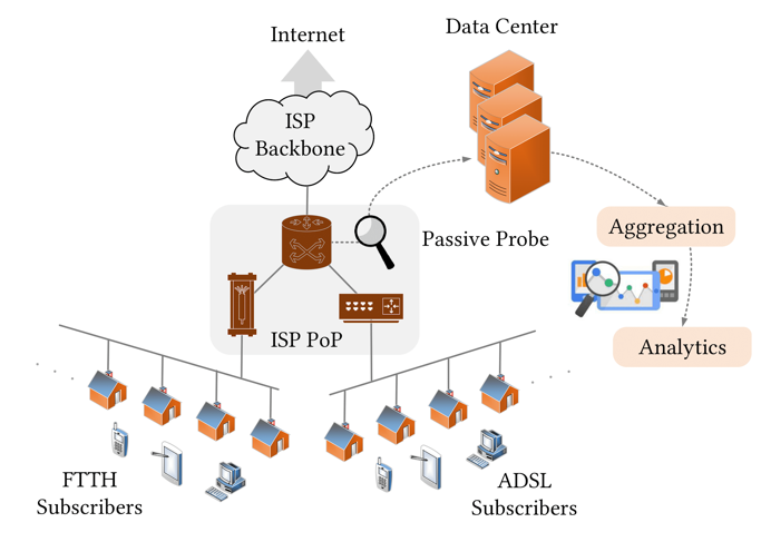
Figure 1 — Schematic of measurement infrastructure and processing steps.
Daily usage increased 2.5x
We first characterized the amount of traffic consumed by subscribers per day, over the past five years. This analysis is useful for understanding and predicting expenses for ISPs in terms of capacity.
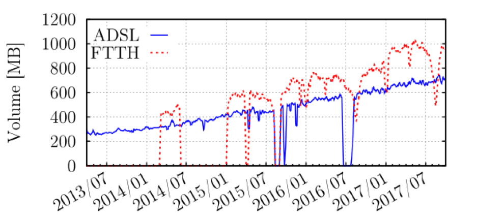
Figure 2 — Average daily download per subscription.
Figure 2 depicts the average traffic consumption for an ordinary broadband subscriber per day. From 2013 to 2017, traffic more than doubled, increasing from less than 300MB/day/user to more than 700MB/day/user.
FTTH users also consumed more traffic, topping 1GB/day/user. Bandwidth-hungry video services are thought to be driving this change, while social messaging applications spike (and fall) as quick as their popularity.
Instagram, WhatsApp and Bing rise, as SnapChat falls
We next characterized the popularity of services over time. Figure 3 details how many users in a given day were actually accessing a service.
Google’s search engine was the most consistently used application over the five years (>60% of users), while the use of Bing grew from less than 10% to greater than 45%. Note, this is actually inflated by Windows telemetry, which reports to bing.com.
YouTube and WhatsApp usage also grew fairly significantly over this time — both were being used by more than 50% of users on a daily basis by the end of the survey.
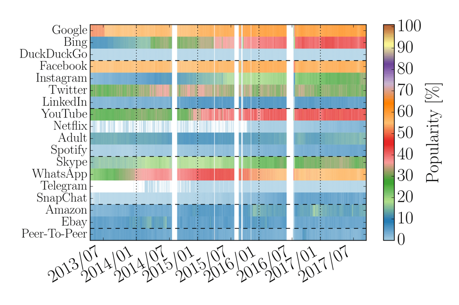
Figure 3 — Popularity of selected services over time.
We recorded constant growth in the popularity of newly released, content-rich social media applications, particularly SnapChat, WhatsApp, and Instagram, all of which corresponded with significant growth in data usage, as shown in Figure 4.
Interestingly, while they all almost mirrored each other in terms of growth, SnapChat started to fall away dramatically from mid-2016; Instagram users were, by mid-2017, using 150MB of data on average, the same amount consumed by YouTube users; and WhatsApp users exchange about 10MB daily despite the app being mainly designed for messaging. Finally, notice WhatsApp peaks during holidays when everybody exchange wishes, doubling their daily traffic.
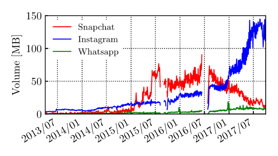
Figure 4 — Average daily download per ADSL subscription for Snapchat, Whatsapp and Instagram.
How protocols evolved over time
We studied next how protocols and service infrastructures evolved over time, highlighting unpredictable events that may hamper traffic management policies. Figure 5 shows the breakdown of web traffic by application protocol.
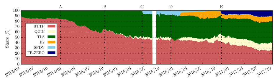
Figure 5 — Web protocol breakdown over five years. Sudden changes and custom protocol deployments are highlighted by the letters, for example, the decline of HTTP (A) and introduction of QUIC (B).
In 2013, 90% of traffic was over HTTP with just 10% over HTTPS (A). Since then, we witnessed the introduction of new protocols by big players that control both the server infrastructure, and the client applications.
Google started deploying QUIC in October 2014 (B), experimenting with this new protocol years before bringing it to the IETF for standardization. The same happened later with SPDY (C), which was abandoned shortly after in favour of HTTP2.
Facebook also developed and deployed its custom solution — Facebook-Zero (E). Being proprietary, nobody knew of its existence, despite more than 10% of web traffic being carried over it from 2017.
The evolution of the infrastructure
In the rush to bring servers closer to users, we witnessed the birth of the sub-millisecond Internet, with caches located directly at ISP edge frontiers. Figure 6 shows the cumulative distribution function of the Round Trip Time (RTT) from the client to the server for YouTube flows. While in 2014, 80% of flows were served by a cache about 3ms far, in 2017, YouTube pushed its server even closer to end users; now 30% of traffic is served by a cache that is just 0.3ms far!
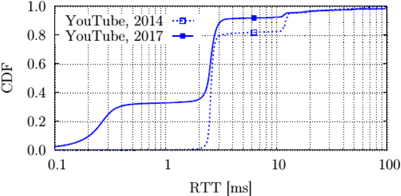
Figure 6 — CDF of RTT in 2014 and 2017 for YouTube.
Trends help to plan for future usage
By processing large-scale and longitudinal measurements from a national-wide ISP from 2013 to 2017, we characterized the traffic consumption of broadband subscribers, and the infrastructure web services deployed to reach customers.
We believe the figures we presented in this post are vital to researchers, ISPs and even web service providers to better understand and better plan for the liveliness of the Internet.
The paper, ‘Five Years at the Edge: Watching Internet from the ISP Network’ was presented at ACM CoNEXT 2018.
Contributors: Martino Trevisan, Idilio Drago, Marco Mellia, and Maurizio Munafò
Danilo Giordano is an Assistant Professor at Politecnico di Torino.
The views expressed by the authors of this blog are their own and do not necessarily reflect the views of APNIC. Please note a Code of Conduct applies to this blog.
Awesome work and data set, but Figure 3 it’s hard to read, as you have to go back and forth the legend to understand if the colour you see represents high or low popularity. Probably one shade of red, green, grey or a traditional heatmap scale could help a lot.
Hi Sebastian, thanks for your comment. We tried to use a more traditional color map. However since the different in popularity is very high among services, with a traditional color map you could not appreciate little increases. For instance an increase of 5 or even 10% may be hard to spot on a scale between 0 and 100%.