

One of APNIC’s many information tools is the Dashboard for Autonomous System Health (DASH). DASH lets you rapidly track suspicious traffic seen coming from your network. It uses a system of ‘honeypots‘, which keep tabs on suspicious traffic. When stitched together, honeypots are called a honeynet.
So we decided to take some of the back-end data from DASH and put it through its paces to see what we could find out about where suspicious traffic is occurring, and set up a bit of an informal ‘ranking’.
There are, of course, quite a few caveats which I’ll discuss in this post.
Today I’ll take a broad look at the APNIC region. In future instalments I’ll drill down a bit more into what’s happening in certain economies, and worldwide. Bear in mind that the proportions of suspicious traffic seen in different areas can and do change over time, so what this post looks at is effectively a snapshot of a point in time. There’s always the potential an economy will look better next time!
DASH is an APNIC service that rapidly tracks suspicious traffic seen coming from your network. It compares your organization against your economy or sub-region and generates reports for informed decision-making. It looks at traffic from the context of where it ‘originates’. It makes use of BGP and address allocation and assignment data.
Most online measurement and ranking systems APNIC operates are about the ‘good’ side of the Internet, and typically about things seen passively or received, in routing or in DNS, or by active measurements recruited through the APNIC Labs advertising model of end-user capability. DASH is a little different. It’s a collaboration between the APNIC Security team and CERT/CSIRTs operating honeynet sites.
What DASH data is being examined?
Using DASH, we’ve been able to look at over a year’s worth of aggregated data for attacks that use the SSH (TCP port 22) method, and summarized them by economy. This created an informal ‘ranking’ based on how much it varies from what would be expected, by population and user base, for the economies.
For this post, no specific ASN results are identified. For privacy reasons, the post only covers the sum of reports from individual ASNs within each economy.
Overall, Asia-Pacific economies are doing well when measured against the world. There are of course some outliers, for example, economies with more and less than expected SSH attack traffic, but in the main, the Asia-Pacific appears to be on the ‘good’ side.
Why do we mostly examine SSH attacks?
SSH is a TCP protocol. It is on TCP port 22. So in this case, port 22, TCP port 22, and SSH are all referring to the same thing. We are mostly examining attacks that use TCP here, because we need to see packets go back-and-forth to show it’s not a spoofed source. This provides a good idea of where the attacks are occurring. UDP traffic, on the other hand, wouldn’t be as good for geographical analysis because it’s not provably from a sender origin-AS. So we tend to just use UDP data in situations where we can show that two-way data flow is taking place.
Put simply, it’s harder to know where UDP attacks are coming from. So we’re analyzing the types of attack which give us some more reliable location information, and we only use UDP data when we have that two-way information on that data.
What did the data say?
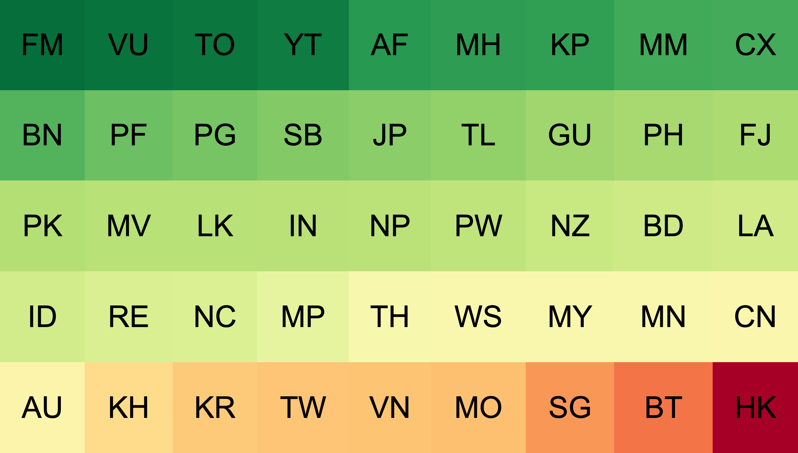
Here’s a simplified diagram of a year’s worth of data, coded with a basic ‘traffic light’ colour scheme. Green economies are doing well, with significantly below expected signs of SSH attack attempts. Amber economies are doing about as much as their user population would imply. Red economies have higher than expected suspicious traffic, by user numbers.
There’s not yet a strong basis to explain why individual economies are showing better or worse on this scale. I discussed this with the APNIC Security team, Adli Wahid and Jamie Gillespie.
Jamie says the honeypot feed used to provide information to DASH can sometimes get false positives. Threat intelligence systems, which are searching for open ports via active probes, can sometimes resemble suspicious traffic themselves and also pose problems when analyzing location.
“They look for SSH version banners and other identifying features of the server, usually without attempting to log in. But they don’t publish their scanner locations, so that makes it hard to attribute scanners to networks or economies,” he says.
Unfortunately, this means the analysis could include false positives of portscans by security analysis systems: rather than suspicious traffic, it might be security teams conducting exercises that resemble suspicious traffic.
We’ve got a year’s worth of DASH data broken down by month. In future blog posts I’ll look at some of the dynamics of the SSH attack profile numbers by economy, to explore what we might be seeing a bit more in detail.
How did APNIC get this data?
Given the limits in what we can discuss in terms of ‘why’ these economies show these figures, let’s instead examine ‘how’ we figured this out.
Consider a fictional example running a honeynet for the apache-2.2 webserver
Apache 2.2 is a very old version of the code for a web server. It’s currently on version 2.4.46 and the 2.2 version was marked end-of-life in 2018. This means the Apache Software Foundation isn’t shipping patches for any bugs or threats open in the server, and it’s reasonable to believe there are some. This is why Apache 2.2 is an attractive target to attack, and explains why you might see more probing attempts to find it.
Of course, you probably don’t want to set up an Apache 2.2 server just because you think it will draw suspicious traffic.
Instead, you can listen on TCP port 80 and 443 (for HTTP and HTTPS protocols respectively) and send the TCP packets which make people think you are an apache 2.2 server. That means responding with all the data in the HTTP protocol which matches and — if you are on a secure HTTPS protocol — using a version of the SSL/TLS protocols matching what Apache 2.2 would use.
Now, you’re talking and behaving like an Apache 2.2 server without needing to actually be one. It should be enough for the ruse.
What happens after that depends on how complex your honeynet service wants to be. It can range from refusing to do any more, all the way up to running a fake UNIX operating system and allowing them to upload rootkits and other malware. This is out of the DASH project’s scope because it’s mainly just interested in two things:
- That someone tried to break in using the TCP/IP protocol and there was a back-and-forth protocol flow to show this was not a ‘spoof source’ packet, but was able to complete the TCP/IP handshake.
- That we believe we understand the BGP routing table, and RIR allocation and assignment data of the time we got this packet, so can make statements about the attribution of the attempt to the origin-AS and the delegate of the resources. From both of these, we can also get the economy and (sub)region.
We then collate this data in a way which lets us construct rankings, frequency, time and other plots, for the origin-AS, the economy and the region.
But it might have been a spoofed-source packet, right? That happens all the time!
It is true that a lot of data captured by open-access systems includes spoofed-origin packets. With these packets, if there is no ‘reply to the reply’ because it doesn’t go back to the person who sent it, it goes to the person they are spoofing.
In other words, you’re not sending it back to the scammer, you’re sending it back to whomever/whatever they’re impersonating.
The key thing here is to show the traffic flow.
By limiting the collection of data to protocols where a ‘flow’ of traffic (Send, Receive, Send (showing Received)) can be shown, it can be argued that it’s more strongly indicative that the apparent origin is in fact originating, and the apparent IP address of the sender has enough state to demonstrate it understood that you, and it, were in a 2-way protocol: the sequence numbers, and the protocol behaviour strongly indicate a real path to the system.
On that basis, DASH limits itself to protocols where there is evidence of a two-way flow. For example, the SSH protocol (port 22) which cannot successfully log an attempt to ‘login’ until it has completed the SSL/TLS protocol handshake, and consequently had 2-way packet flow.
What’s ‘good’ and ‘bad’ according to this method?
What APNIC’s been able to do is to look back on the data DASH is collecting by economy and produce a ranking to show the ‘best’ in terms of how few packets we are seeing originated. This is a little unusual for ‘best’ measures. Normally, we want to count ‘more’ things but in the case of suspicious traffic, less is more. So, the rank here is based on having the least visible harm coming out of the origin-AS ascribed to the economy.
But what about scale? How can Fiji be compared with Indonesia?
This is a good question. We’ve taken care of it by using a similar weighting method APNIC Labs uses to show comparative inter-economy ranks. The figures shown have been adjusted to account for how much traffic expected to be seen from these economies, all other things being equal. So, it’s not the actual raw volume which counts, it’s the variance of the volume from the expected volume given the relative size of the economy (assuming any bad traffic is equally likely to come from any user).
APNIC Labs ranks the ‘amount’ per economy, so it can be combined in the proper ratio to scale to a region, looking at the variance of the ratio against the expected ratio by scale. This illustrates how much ‘more’ of the problem is seen than expected, all things being equal. If one economy has twice the population of another, one would expect to see twice the suspicious traffic. That wouldn’t necessarily be bad. If it had five times the suspicious traffic on the other hand, then it’s not doing so great, relatively speaking. But this still isn’t representative. Here’s a look at the chart if weighed just by population.
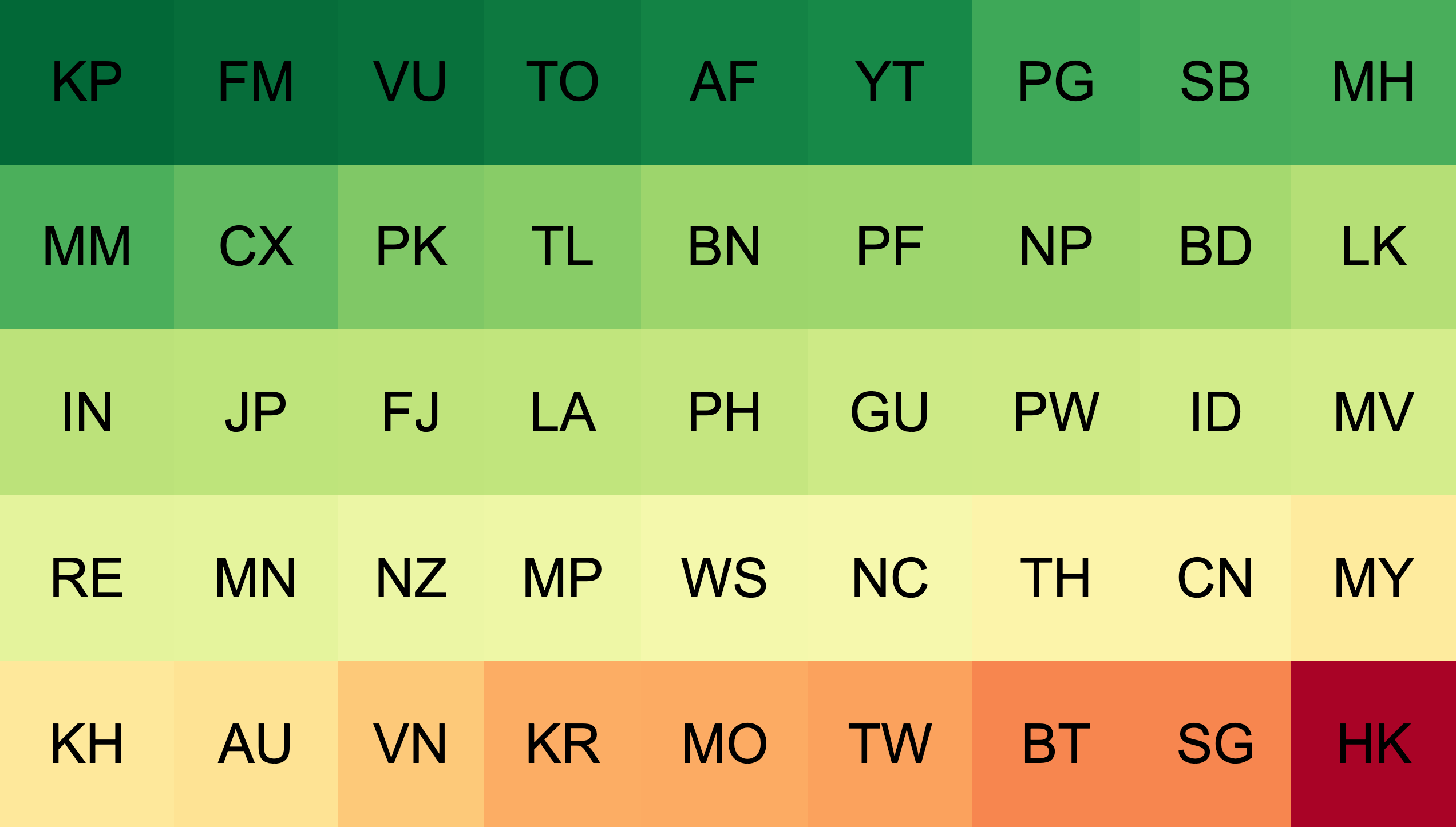
North Korea performs extremely well by this measure, but this is possibly due to a relatively high overall population with low numbers of Internet users, leading to low overall traffic and low suspicious traffic. When adjusted for the population of Internet users instead of the overall population, we get a very different picture.
So that was the first deep dive into DASH data! If you have any thoughts on it, feel free to comment below. You may also want to give DASH a try yourself, to check whether there is any suspicious traffic coming from your network. In future instalments we’ll dig a little more deeply into certain regions of interest.
Byron Ellacott contributed to this post.
The views expressed by the authors of this blog are their own and do not necessarily reflect the views of APNIC. Please note a Code of Conduct applies to this blog.