

Original post appeared on PowerDNS technical blog.
DNS performance is always a hot topic. No DNS-OARC, Regional Internet Registry or IETF conference is complete without new presentations on DNS performance measurements.
Most of these benchmarks focus on denial-of-service resistance: What is the maximum query load that can be served? This is indeed a metric that is good to know.
Less discussed, however, is performance under normal conditions. Every time a nameserver is slow, a user somewhere is waiting. And not only is a user waiting, some government agencies, one of which is the UK’s OFCOM, take a very strong interest in DNS latencies. In addition, in contractual relations, there is frequently the desire to specify guaranteed performance levels.
So, how well is a nameserver doing?
“There are three kinds of lies: lies, damned lies, and statistics.” – unknown
It is well known that when Bill Gates walks into a bar, on average, everyone inside becomes a billionaire. The average alone is therefore not sufficient to characterize the wealth distribution in a bar.
A popular and frequently better statistic is the median — 50% of numbers will be below the median, 50% will be above. So, for our hypothetical bar, if most people in there made ‘x’ a year, this would also be the median (more or less). Now that Bill Gates is there, the median shifts up only a little.
In many cases, the median is a great way to describe a distribution, but it is not perfect for DNS performance. The way DNS performance impacts user experience makes it useful to compare it to ambulance arrival times.
If, on average, an ambulance arrives within 10 minutes of being called, this is rather good. But if this is achieved by arriving within 1 minute 95% of the time, and after 200 minutes, 5% of the time, it is pretty bad news for the one in twenty cases. In other words, being very late is a lot worse than being early is good.
The median, in this case, is somewhat less than one minute, and the median therefore also does not show that we let 5% of cases wait for more than three hours.
To do better, for the ambulance, a simple histogram works well:
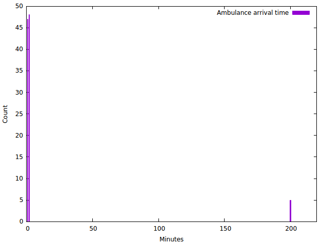
This graph immediately makes it clear there is a problem, and that our ’10-minute average arrival time’ is misleading.
Although a late DNS answer is of course by far not as lethal as a late ambulance (unless you are doing the DNS for the ambulance dispatchers!), the analogy is apt. A two-second late DNS response is absolutely useless.
Sadly, it turns out that making an arrival time graph of a typical recursive nameserver is not very informative:
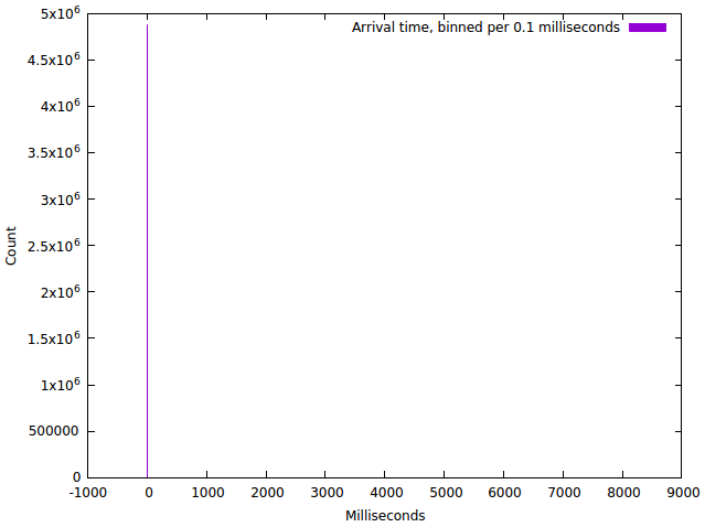
From this graph, we can see that almost all traffic arrives in one bin, likely somewhere near 0.1 milliseconds, but otherwise, it doesn’t teach us a lot.
A common enough trick is to use logarithmic scales, and this does indeed show far more detail:
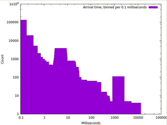
From this graph, we can see quite some structure — it appears we have a bunch of answers coming in real quick and also somewhat of a peak of around 10 milliseconds.
But the question remains, how happy are our users?
This is the question (inspired by a blog post we can no longer find) that we spent an outrageous amount of time on answering, and which we now proudly present a tool to measure:
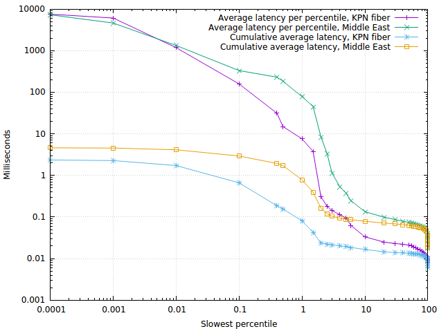
The logarithmic percentile histogram
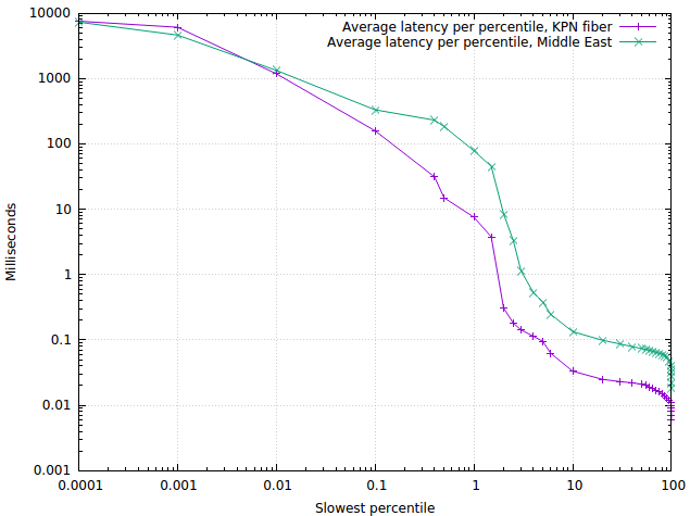
So what does this graph mean? On the x-axis are the ‘slowest percentiles’. So, for example, at x=1 we find the 1% of answers that were slowest. On the y-axis, we find the average latency of the answers in that ‘slowest 1%’ bin: around 8 milliseconds for the KPN fibre in our office, and around 90 milliseconds for a PowerDNS installation in the Middle East.
As another example, the 0.01 percentile represents the ‘slowest 1/10,000’ of queries, and we see that these get answered in around 1,200 milliseconds — at the outer edge of being useful.
On the faster side, we see that on the KPN fibre installation, 99% of queries are answered within 0.4 milliseconds on average — enough to please any regulator! The PowerDNS user in the Middle East is faring a lot less well, taking around 60 milliseconds at that point.
Finally, we can spruce up the graph further with cumulative average log-full-avg.
From this graph, we clearly see that even though latencies go up for the slower percentiles, this has little impact on the average latency, ending up at 2.3 milliseconds for our KPN office fibre and 4.5 milliseconds for the Middle East installation.
So, what can we do with these graphs?
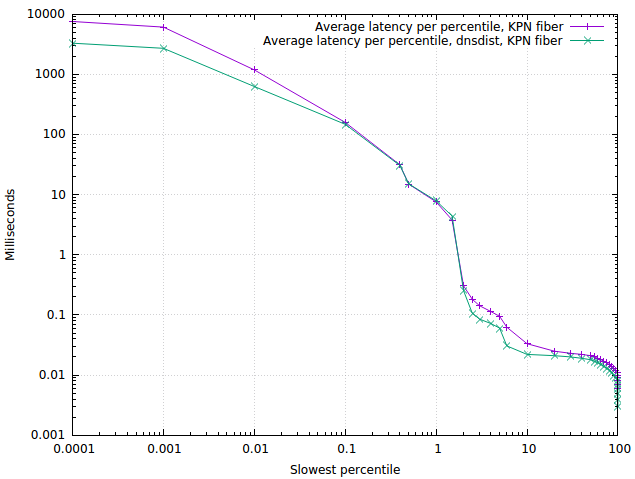
Through a ton of measurements in various places, we have found the logarithmic percentile histogram to be incredibly robust. Over time, the shape of the graph barely moves unless something really changes, for example, by adding a dnsdist caching layer:
We can see that dnsdist speeds up both the fastest and slowest response times, but as could be expected does not make cache misses (in the middle) any faster. The reason the slowest response times are better is that the dnsdist caching layer frees up the PowerDNS recursor to fully focus on problematic (slow) domains.
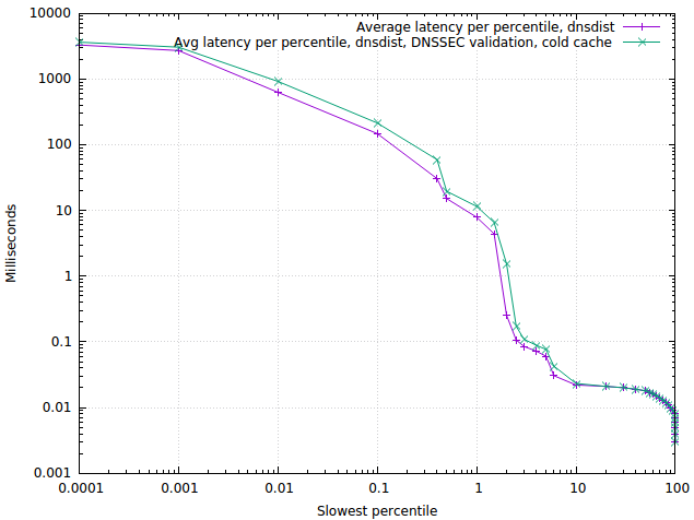
Another fun plot is the ‘worst case’ impact of DNSSEC, measured from a cold cache:
As we can see from this graph, for the vast majority of cases, the impact of DNSSEC validation using the PowerDNS recursor 4.1 is extremely limited. A rerun on a hot cache shows no difference in performance at all (which was so surprising we repeated the measurement at other deployments where we learned the same thing).
Monitoring/alerting based on logarithmic percentile histogram
As noted, the shape of these graphs is very robust — temporary outliers barely show up for example. Only real changes in network or server conditions make the graph move. This makes these percentiles exceptionally suitable for monitoring. Setting limits on ‘1%’ and ‘0.1%’ slowest performance is both sensitive and specific: it detects all real problems, and everything it detects is a real problem.
How to get these graphs and numbers
In our development branch, dnsreplay and dnsscope have gained a ‘–log-histogram’ feature, which will output data suitable for plotting. Helpfully, a gnuplot script is included in the data output that will generate graphs as shown above. A useful output mode is svg, which creates graphs suitable for embedding in web pages:
Note that this graph also plots the median response time, which in this instance comes in at 21 microseconds.
Now that we have the code available to calculate these numbers, they might show up in the dnsdist web interface, or in the metrics we generate. But for now, dnsreplay and dnsscope are where it is at.
Bert Hubert is a software developer and founder of PowerDNS
The views expressed by the authors of this blog are their own and do not necessarily reflect the views of APNIC. Please note a Code of Conduct applies to this blog.
Yes, this is a useful visualisation of worst-case behaviour!
But actually, it is widely used in the scientific literature under the name “CCDF” (Complementary Cumulative Distribution Function). It’s the same idea but with the axes reversed.
See for instance on page 4 of http://www.net.t-labs.tu-berlin.de/papers/AMSU-CDRW-10.pdf (figure 1). On the top-left you have common samples with good performance, while on the bottom-right you have rare samples with bad performance.
The really classical visualisation of a distribution is a CDF with linear scale, but it does not show well the tail of the distribution (extreme behaviours). The CCDF basically reverses the Y-axis and uses a logscale to magnify the tail of the distribution.