

For the past two years, we at the .nz Registry Services have been building a source address classifier that can tell, with a certain probability, if a source address observed at .nz represents a DNS resolver or not. It has been a trail-blazing task with multiple iterations of exploration and improvement.
The core work has been covered in my previous posts: ‘Source Address Classification – Feature Engineering’ and ‘Source Address Classification – Clustering’. Here we’ll summarize the final results, as presented at DNS-OARC 29, and share the classifier’s output for other DNS operators and interested parties to review.
Removing noise from DNS traffic
DNS traffic is noisy — containing monitoring hosts and spontaneous sources of unknown origin.
Our original intention for detecting resolvers was to remove this noise from the DNS traffic used to calculate the domain popularity ranking we developed at .nz — we sought to only consider queries representing user’s activity on the Internet.
Using our DNS expertise, we were able to identify and remove some likely noise to prepare a cleaner and smaller dataset for a machine learning model.
We took the DNS traffic data from across four weeks between 28 August 2017 and 24 September 2017 for our analysis. There were two million unique source addresses in this period, of which:
- 27.8% only queried for one domain
- 45.5% only queried for one query type
- 25% only queried one of seven .nz name servers
- 65.8% sent no more than 10 queries per day
We assumed these sources either don’t behave like a typical resolver or generate very little traffic to .nz to make it representative. By removing these sources we reduced the number of addresses to 550K.
Within these 550K source addresses, some are only active for a short time or a few days. We assumed the inactive sources don’t represent the main population of .nz or are not stable IP addresses. We extracted the most active sources, those that were visible five out of seven days per week, and at least 75% of the total hours (a threshold picked according to Figure 1). This gave us 82K.
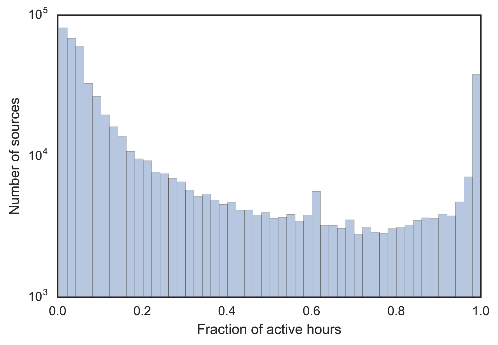
Figure 1 — Distribution of source address activity by visible hours.
We assumed these 82K sources can be divided into two classes: resolvers and monitoring hosts.
Using machine learning to solve classification
To use machine learning, we need a feature set and some training data to build a supervised classifier that can predict the probability of a source is a resolver. We explored some known resolvers and monitors, which showed diverse behaviours and no clear demarcation based on a single feature (see Figure 2). The key is to find feature combinations that can help discriminate both types.
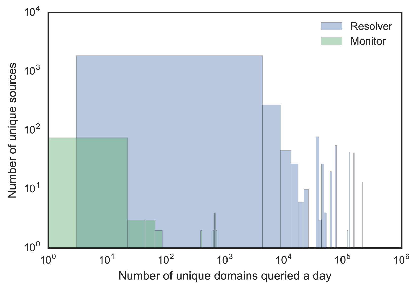
Figure 2 — Resolver and monitor distribution by two different features.
We repeatedly tested clustering results following the iterative addition of new features. Once we achieved a good clustering result, we built a final classifier based on these features.
Specifying feature set
We choose a four-week period for our training so it would include both daily and weekly patterns. We used features representing various aspects and elements of the DNS protocol.
For each source, we extracted the proportion of DNS flags, common query types, and response codes. For activity, we calculated the fraction of visible weekdays, days and hours.
Aggregated by day, we constructed a time series for query count, unique query types, and unique query names. We then generated features for these time series using descriptive statistics such as mean, standard deviation and percentiles.
We also created timing entropy and query name entropy features. These were based on the assumption that a resolver’s behaviour should be more random than a monitor, or, in other words, there should be a bigger entropy in a resolver’s query stream than in a monitor’s.
For timing entropy, we calculated the time lag between successive queries and between successive queries of the same query name and query type. For query name entropy, we used the Jaro-Winkler string distance to calculate the similarity of the query names between successive queries.
Combining the above features, we still did not get a satisfactory clustering result. Further, we came up with features that could catch the variability of a query flow considering that a monitor’s query flow should be less variable compared to a resolver. We aggregated the query rates by the hour (query frequencies, number of unique query types and query names) and entropy features, and then calculated a set of variance metrics including Inter-quartile Range, Quartile Coefficient of Dispersion, Mean Absolute Difference, Median Absolute Deviation, and Coefficient of Variation.
In total, we came up with 66 features for a given source address. We removed those with a correlation score above 0.95 to reduce the redundancy of our model. We then checked the relevance of the best features according to the labelled samples we had.
Using F-test and Mutual Information (MI), we could see which features were relevant and which were not (Figure 3). Removing the irrelevant features, we finally ended up with 50 features.
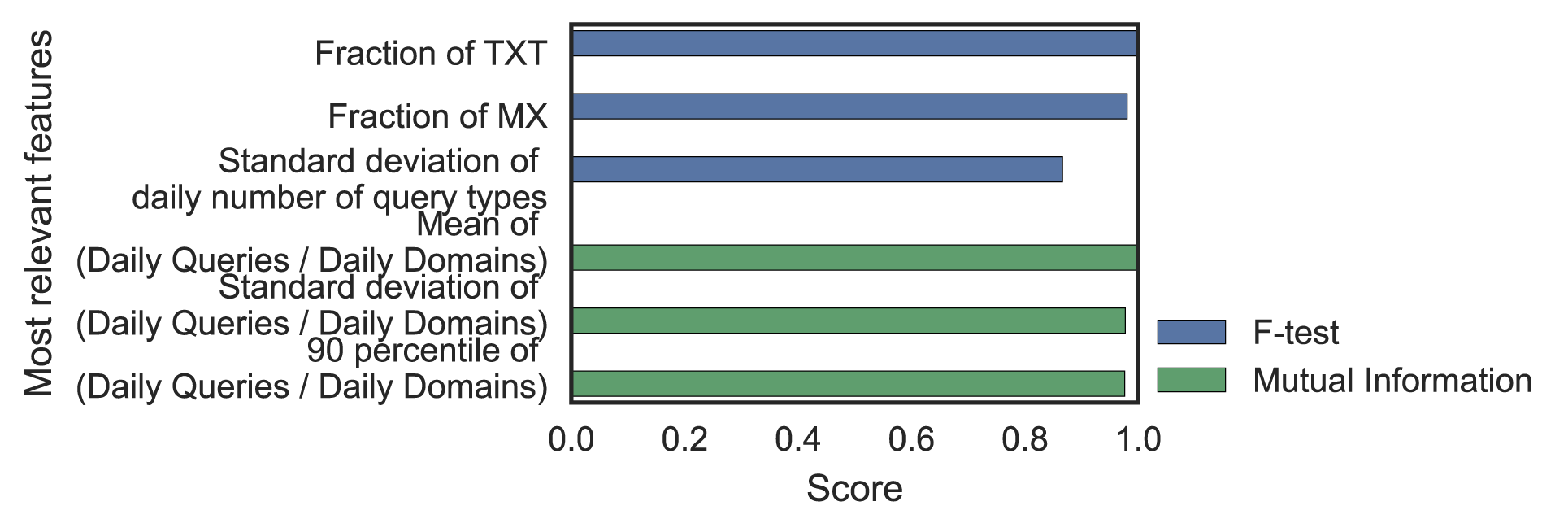
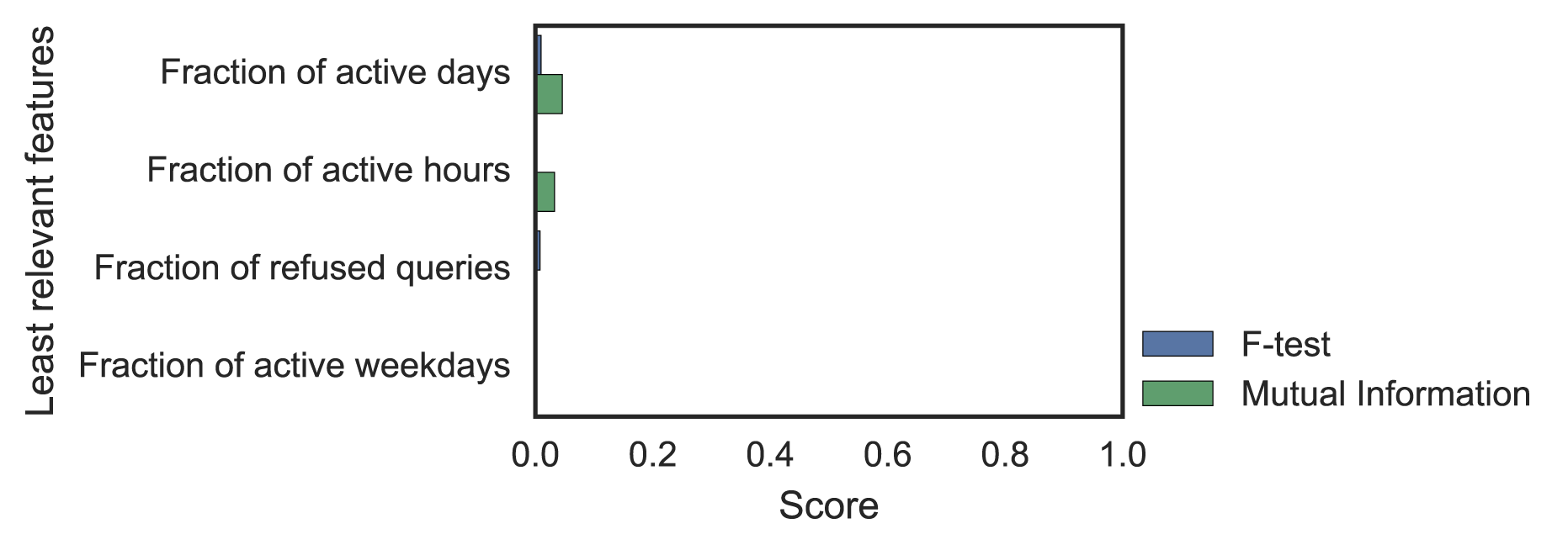
Figure 3 — F-test and Mutual Information scores for most and least differentiating statistical features.
Verifying features by clustering
Clustering is an approach to explore how the source addresses are grouped together based on similar patterns. We sought to verify our feature set by clustering similar sources and separating different ones.
We tried a range of algorithms including K-Means, Gaussian Mixture Model, MeanShift, DBSCAN and Agglomerative Clustering, with hyperparameter tweaks. We evaluated the models using a couple of metrics, including Adjust Rand Index, homogeneity score and completeness score, and searched for the best performing model using the Gaussian Mixture Model. This result in five clusters; Figure 4 shows how known samples distribute across these five clusters.
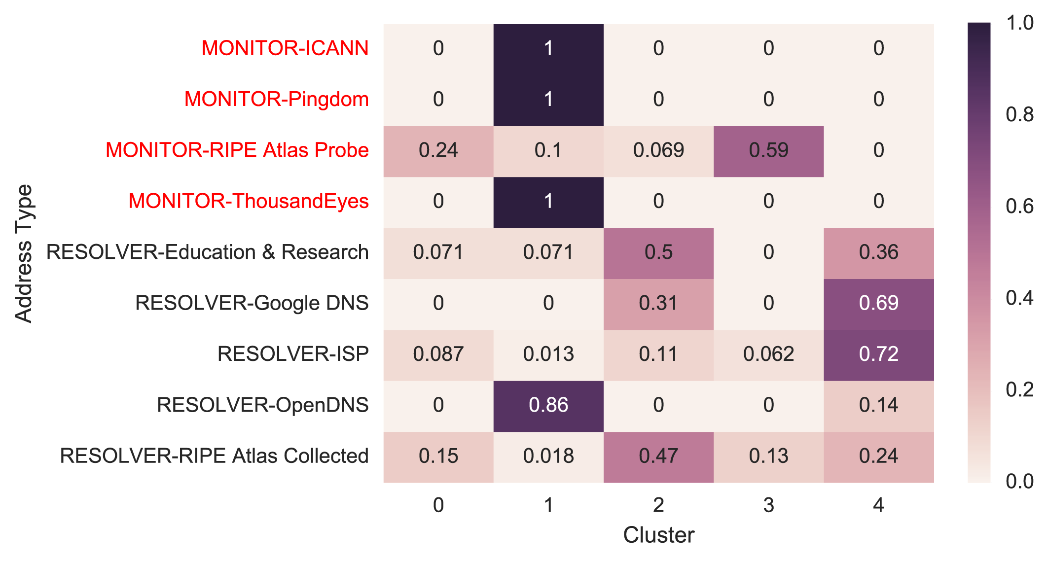
Figure 4 — Known samples’ distribution across clusters.
The number in the cell of the heat map is the fraction of a particular type of samples, for example, ICANN monitors for the first row, that fall into a cluster. We can see monitors are mostly in cluster 1, except many of RIPE Atlas Probes are distributed in Cluster 0 and 3. This is probably because of non-monitoring RIPE Atlas Probes which behave differently from monitoring ones.
For resolvers, Google DNS and ISPs are mostly in Cluster 4, while OpenDNS’s behaviour is completely different from other resolvers. We temporarily set aside OpenDNS for its unexpected behaviour and will explore it in the future.
We then aggregated the rest of the resolvers and monitors. From the heat map below (Figure 5), we can see most of the monitors are in Cluster 1, and most of the resolvers are in Cluster 2 and 4.
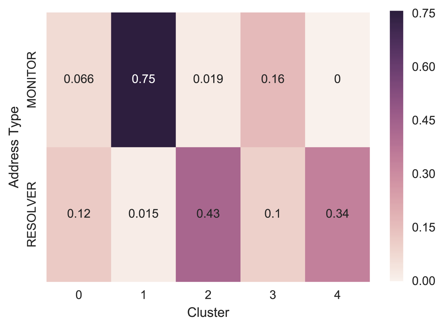
Figure 5 — Known samples’ aggregated distribution across clusters.
The clustering is not perfect, but it shows the power of our feature set in separating different source types correctly, in general. We then used this feature set to train a classifier.
Training the supervised classifier
Our training data composed of 2,515 resolvers and 106 monitors. The resolver set came from ISPs in New Zealand, Google DNS, OpenDNS, education and research organizations in New Zealand and resolvers used by RIPE Atlas probes. The monitors came from ICANN, Pingdom, ThousandEyes and RIPE Atlas probes and anchors. We extracted the 50 features across the four week period in our DNS traffic for each source address to build a supervised classifier.
Using automated machine learning techniques with efficient Bayesian Optimisation methods, we trained an ensemble of 28 models in 10 minutes and achieved 0.991 accuracy and a score of 0.995 F1.
Prediction result
For each source address, we let the classifier predict its probability of being like a resolver. We then labelled those with a probability higher than 0.7 as resolvers. We tested this prediction with our domain popularity ranking algorithm and it observably improved the ranking accuracy of some known domains.
We would like to share the prediction based on our traffic from 3 September 2018 to 30 September 2018 with anyone interested to review with their own data (SHA1 checksum: 6448202ad39be55c435ba671843dac683b529bce).
Potential use and future work
This work has several applications.
It can improve the accuracy of domain popularity ranking.
Further, with some adjustment of feature set and training data, it can be expanded to other uses using DNS passive captures. For example, to measure the adoption of new technologies such as DNSSEC validating resolvers, QNAME minimization in the wild.
The method can be applied to a different dataset like the root zone and other TLDs and results can be shared and compared.
Adapted from original post which appeared on the .nz Registry Services Blog.
Jing Qiao is a DNS expert at InternetNZ.
The views expressed by the authors of this blog are their own and do not necessarily reflect the views of APNIC. Please note a Code of Conduct applies to this blog.