

When doing any kind of measurements, visualizing the data is often a first step in getting a grasp of what is really going on.
The space-filling Hilbert Curve works well when visualizing the IPv4 address space; allowing users to plot the entire address space and yield a usable image. But in IPv6, the address space is simply too large and too sparsely used to get anything useful out of such a plot.
Our visualization tool zesplot, takes a different approach. While still based on a space-filling algorithm, it only visualizes what is explicitly passed as input. It can be used to plot a single /64, all of the ~60k announced prefixes in BGP, or anything in between.
A first proof-of-concept version of zesplot was presented during the MAPRG session at IETF 101 earlier this year. After that, it was greatly adapted to suit the needs of our collaborative IPv6 ‘hitlist’ study, to be presented at IMC ’18 in November.
This blog post explores some of the concepts zesplot is built on, supported by examples of what the tool can create. As zesplot development is still ongoing, feature requests, ideas, or any other types of input are greatly appreciated.
Squarified treemaps
Zesplot visualizes address space using squarified treemaps, a space-filling algorithm that fills a canvas with rectangles aiming at optimal human readability.
In-depth information can be found in the linked paper, but the short version is: when given a set of areas to be plotted, the algorithm fills the canvas by creating columns and rows of these areas. It starts with a column, adding areas to the column until the aspect ratio of the rectangles become ‘unpleasant’ to the human eye. As soon as this happens, it starts constructing a row, again adding rectangles until the aspect ratio becomes sub-optimal, and so on. The end result is a visualization of all the areas in the input set, filling the entire canvas in square-like rectangles.
Now let’s translate this to IPv6 address space.
Inputs: prefixes and addresses
In our case, the ‘areas’ we want to visualize are IPv6 prefixes. Every prefix has a certain size — the prefix length — which we use as the ‘size of the area’. So, a /32 will be a larger rectangle than a /48, for example.
Naturally, a list of prefixes forms the basis of a zesplot and thus is mandatory input for the zesplot tool. Additionally, a list of IPv6 addresses can be passed. These addresses will be matched to the provided prefixes, resulting in a hit count for every prefix. This hit count determines the colour of the rectangles in the final plot.
Depending on the exact input data, this enables users to spot biases or outliers in a large dataset.
As the best results are obtained when the biggest areas (thus, the prefixes with the shorter prefix lengths) are plotted first, a zesplot should be read from top left to bottom right. The axes have no meaning.
Example zesplots
Our IMC ’18 study focuses on constructing a representative IPv6 hitlist. Zesplotting all prefixes announced in BGP, we can easily spot which prefixes contain most of the addresses on our hitlist. While most prefixes are coloured blue-ish, some outliers stand out being yellow or red. An interactive version of this plot shows exact hit counts as well as AS numbers.
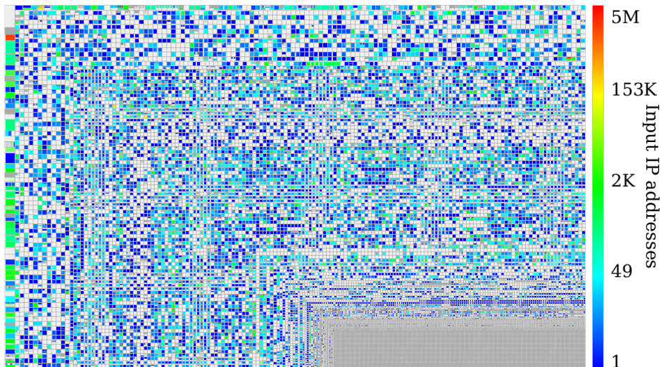 Figure 1 — BGP-announced prefix coverage of the hitlist.
Colouring can be done on metrics other than the numbers of hits in a prefix. Zesplot can apply various statistical functions on metadata passed with the addresses. If, for example, we take the list of addresses responding to pings, and pass the time-to-live (TTL) value of the incoming responses along with the addresses as input, zesplot can colour the rectangles based on the mean TTL of the prefix being represented.
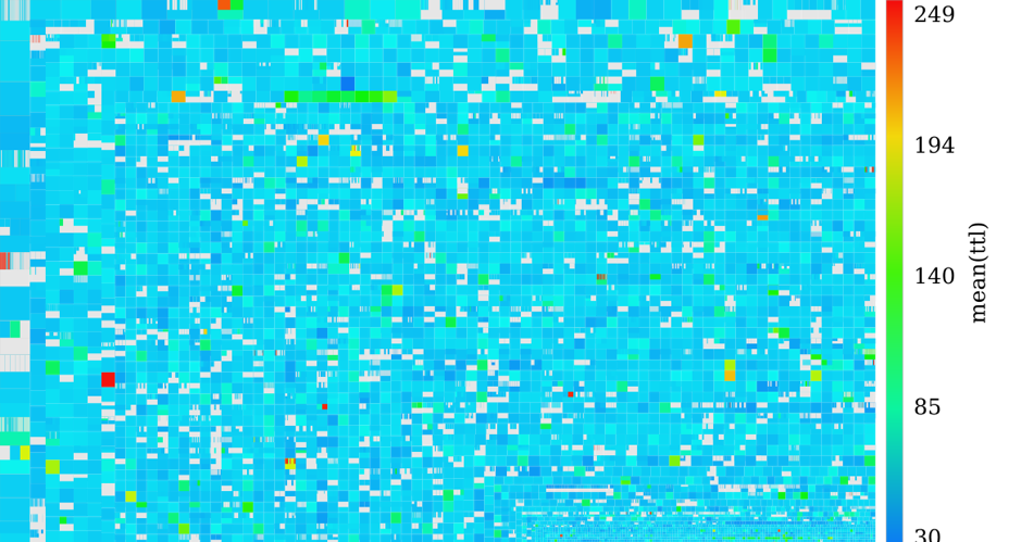 Figure 2 — Mean TTL of responses per prefix.
Besides the mean, zesplot can calculate the median and the variance of the TTL values, or colour based on the number of unique values in the prefix. These functions can be applied as long as the provided metadata is numerical. Possible examples include colouring based on unique TCP Maximum Segment Size (MSS) values, or colouring based on the variance of packet sizes. These options give researchers and other users of the tool plenty of flexibility in exploring and visualizing their datasets.
We can also force the colouring based on explicitly mapping the ASN to a certain class. As part of our IMC ’18 study, addresses were clustered based on their fingerprint entropy, resulting in a classification of ASes in terms of specific clusters. Based on that mapping, we can create a zesplot to visualize which prefixes belong to which cluster, revealing who is announcing many prefixes of the same size with a certain addressing strategy (the big coloured hooks):
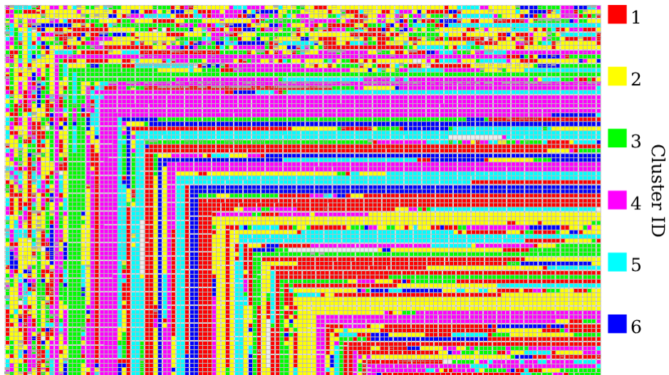 Figure 3 — BGP-announced prefixes coloured based on which entropy cluster their AS belongs to.
More examples of what zesplots can look like can be found on the website related to our study, and in the paper.
What’s next?
The zesplot tool is currently being refactored for improved user-friendliness as well as performance. This means more informative error messages, but also improved ease of use; passing zmap output as input for the set of addresses for example, or directly reading gzipped Prefix to AS (pfx2as) files provided by the Center for Applied Internet Data Analysis (CAIDA) as input for the prefixes.
Got a feature request or any other kind of feedback? Don’t hesitate to open an issue on GitHub, or leave a comment below this post!
Acknowledgments: A big thank you to my co-authors of the hitlist study for their inputs on both zesplot and this post: Oliver Gasser, Quirin Scheitle, Paweł Foremski, Qasim Lone, Maciej Korczynski, Stephen Strowes, and Georg Carle.
Luuk Hendriks is a PhD student at Design and Analysis of Communication Systems, University of Twente, Netherlands.
The views expressed by the authors of this blog are their own and do not necessarily reflect the views of APNIC. Please note a Code of Conduct applies to this blog.
good