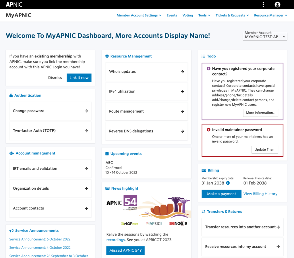
MyAPNIC will soon have a new look. After conducting user research and listening to feedback, APNIC has made improvements to the dashboard interface, navigation, and added easy account switching and some new functionality via widgets.
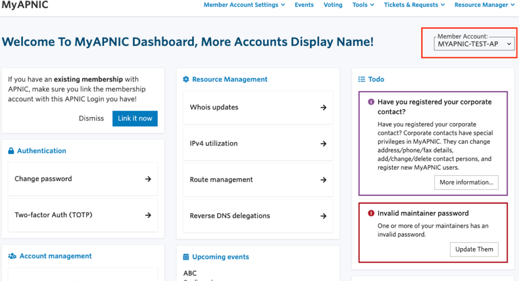
The first thing users will notice after logging in is the full redesign of the dashboard, which makes it easy to find important links, such as billing, events, and training.
New widgets
The new billing information widget allows Members to track billing and payments, and the events widget alerts to upcoming events and APNIC Academy training opportunities that may be of interest.
In this first release, most of these widgets link directly to the pages most used by APNIC Members. In a future release, widget customization will be added.
Alerts and notifications relevant to each Member’s account are also easier to see with a clear call-to-action button guiding them to any corrective measures that may need to be taken.
Improved navigation
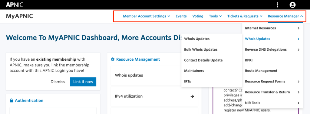
Navigation has also had a major overhaul. The new navigation has been designed so that users can complete the task they came to do as quickly and efficiently as possible.
By incorporating all account management and resource management features, it is now much easier to navigate to any part of MyAPNIC from any page. All links are now always visible, so Members are only one click away from their MyAPNIC destination.
New login features
If Members have multiple accounts, the new account switching widget in the top right corner of each page will allow them to switch accounts quickly and easily.
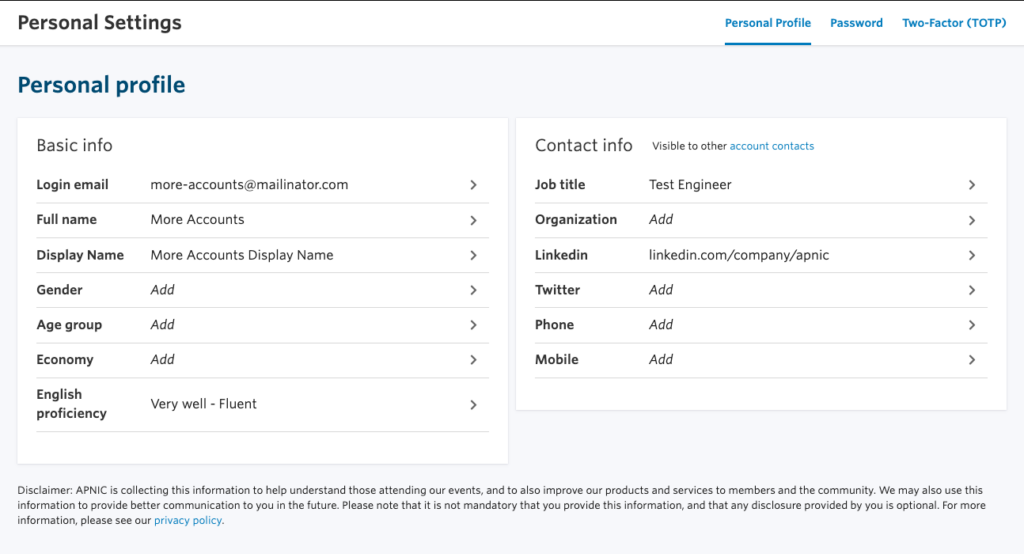
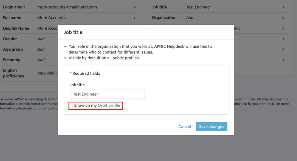
The APNIC login personal profile page has also been reworked based on feedback. The new dashboard contains additional fields that can personalize the experience. Options within the personal profile page will allow users to toggle their visibility on APNIC’s new discussion platform, Orbit.
APNIC is excited to deliver these changes as they form the foundation for new and improved features that are relevant to Members. These features will be released in the coming weeks.
More to come
Keep an eye out for some new and useful widgets coming soon. To help improve APNIC products and services for the entire community, sign up or get more information via the User Feedback Group.
The views expressed by the authors of this blog are their own and do not necessarily reflect the views of APNIC. Please note a Code of Conduct applies to this blog.

