

The Internet is constantly evolving. Outages, attacks, upgrades, censorship, and policy changes frequently modify routing everywhere in the world.
Monitoring these changes is challenging without visualizations because it requires the processing of a large volume of Border Gateway Protocol (BGP) data provided by a platform such as the RIPE Routing Information Service (RIS).
In RIS, various Autonomous Systems (ASes) are peering with a RIS Route Collector, providing an observation point on the inter-domain routing of the Internet. These ASes are called Collector Peers (CP).
The most common approach for displaying BGP data collected is to use an animated graph, for example, BGPlay. In this type of visualization, each node of the graph is an AS and each link is a peering session among ASes. Every time a BGP update is applied, the links in the graph change according to the new status.
Graph animations are not suitable for real-time monitoring for which it is crucial to easily spot differences with previous routing states. In addition, in some cases, the overall perception of an incident can be lost due to the visual complexity.
The Computer Network Research Group of Roma Tre, in collaboration with the RIPE NCC, proposed a new visual interface, named Upstream Visibility, to achieve easier readability of BGP data.
The Upstream Visibility tool is based on three views:
- A global view, which provides a high-level overview of the visibility of an IP prefix.
- A local view, which allows the user to check the visibility of a prefix in a specific location of the network.
- A traditional BGPlay view.
A prototype of the tool was presented RIPE 74. Development is now complete and the new tool is available in RIPEstat in the routing tab.
The interface
The Upstream Visibility tool uses stacked area charts and heat maps for a concise representation of a portion of the inter-domain routing of a specified prefix.
 Figure 1 – The global view of Upstream Visibility showing the DDoS attack on the Dyn DNS from 2016.
The tool shows which upstream providers the various RIS CPs are using to reach the monitored prefix over time.
Figure 1 shows the DDoS attack on the Dyn DNS that happened in 2016. In particular, the image shows the main view (global view) monitoring the prefix 208.76.59.0/24 (AS33517).
The upstream providers of AS33517 are represented by the coloured areas. The x-axis represents the time. The y-axis shows the percentage of CPs able to reach the origin AS through a specific upstream provider. White areas on the chart represent a lack of visibility. In general, when the routing is stable, the global view is composed only by horizontal straight coloured strips.
As you can see, the visibility of the prefix changed dramatically at about 12:45, when most of the CPs started passing through AS10026 (the red area enlarges). From 12:45 to 2:40 the routing is unstable, oscillating between moments where AS4637 (green) and AS2914 (purple) appear and disappear. From 2:40 to 3:35 there are three dramatic losses of reachability followed by periods when the ASes reach AS33517 only through AS2914 (purple). The stable routing state is restored at 4:45.
In this description, we refer, naively, to upstream providers meaning ASes at a distance of one from the origin AS, and we don’t infer any business relation among ASes. In the interface, the user can select what distance from the origin AS should be monitored.
While the global view gives a summary of the visibility status of a prefix, we also provide a local view, which allows the user to check the effects of a visibility change on specific locations of the network, where the CPs are placed.
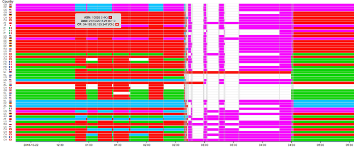 Figure 2 — The local view of Upstream Visibility showing the DDoS attack on the Dyn DNS from 2016.
Figure 2 shows the local view of the same network event used above. The various horizontal segments represent which upstream provider was used over time, by a specific CP, to reach the origin AS. The colours used for representing the ASes are the same across the global and the local view. More information about ASes is available when hovering over the coloured areas.
When users interact with the global or with the local view and find an instance that is especially interesting, they can click on it and get the BGPlay representation of the routing around that time.
We also worked to improve the readability of these kinds of diagrams. We tackled the problem of automatically generating the stacked area charts by designing and evaluating several heuristics able to run directly in the browser. More details can be found in the paper ‘Upstream Visibility: a Multi-View Routing Visualization’, proc. 11th International Symposium on Visual Information Communication and Interaction.
Embedding and source code
Upstream Visibility is a RIPEstat widget. This means it is embeddable in any HTML page. To do so, copy and paste the ’embed code’ — retrievable from the embed code button on the footer of the widget — into your web page.
If you want to contribute, please help us on GitHub.
Feedback
We always want to hear what you think about the tools and services we offer.
To leave feedback or report a bug, please use one of the channels reported here.
For direct feedback, contact the Computer Networks Research Group of Roma Tre at compunet [at] dia.uniroma3 [dot] it, or Massimo Candela at mcandela [at] ripe [dot] net.
You can also leave a comment below.
Adapted from original post which appeared on RIPE Labs.
Massimo Candela is a Senior Software Engineer for the RIPE NCC, focusing on developing web applications that provide a visual and interactive representation of large amounts of network data.
The views expressed by the authors of this blog are their own and do not necessarily reflect the views of APNIC. Please note a Code of Conduct applies to this blog.