

Maps are awesome.
I like all kind of maps; Maps of cities, maps of subway systems, maps of ancient civilizations.
It’s really two things about maps that make me appreciate them. The first is that they show us a point of view that is impossible to see with our own eyes. Look at this map of the Bangkok BTS Skytrain network for example.
It gives me a view of the BTS so different from the tiny piece of track that I can see out my hotel room window. I would have to be viewing the city from close to 30 kilometres above in order to have the same viewpoint. If I were to actually do that however, then the BTS system would actually be too small to see.
This brings me to the second reason that I appreciate maps so much. Maps help us to bring forward just the information that is important. They allow us to discard details that are unimportant to the story that we are using the map to tell. On the BTS map for example, there are no roads, no buildings, no parks, nothing to distract from the information about the BTS system that the map is trying to portray.
In this way maps give us a unique vision of reality, balancing a delivery of the facts, with hiding confusing details. They are both the ultimate speaker of truth and the teller of lies.
Liking maps almost as much as I like the Internet, it’s hardly surprising that I would try and combine the two.
Some time ago a fellow New Zealander named Blair Harrison posted a set of Internet Topology maps to the NZNOG list. Blair and I had been talking and I thought it was about time for me to dive in and make some Internet maps of my own.
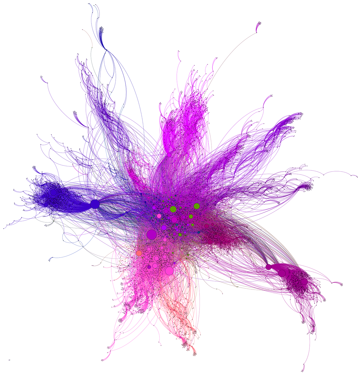
Here’s my attempt at a Map of the Internet including all the organizations in APNIC Member economies.
Mapping the Internet is hard
Which parts do you tell the truth about, and which details do you let fall by the wayside so as to not make it confusing? I’m sure you’ll agree that if we tried to display every single cable and computer on the Internet it would be almost as difficult as trying to pick out a single BTS station from 30km in the air.
The aspects that I wanted to tell the truth about were the interconnections between Members in our region. I wanted to see how one organization connected to another. I was much less concerned with what IP address they had, which city they were in, or even what sort of business they did. Once I knew what I wanted to portray, I searched for a source of information about how organizations connected to each other.
I found one source in the global BGP routing table. When a BGP route reaches you, it carries with it a list of all the organizations it has travelled through along the way, just like a diary of stations that a train has travelled through on its way to you. If I could get all these diaries, or AS paths, to use the correct BGP term, then they would tell me all the ways in which organizations are connected together.
The University of Oregon’s Route Views project contains such a repository.
A day in the life of a BGP route
The Route Views project has sensors deployed at different places around the Internet collecting BGP routes and all the information about the paths they have been on.
I download all the BGP path information for IPv4 and IPv6 that was current at midnight UTC on the 30th of June 2015.
Just like in the physical world, there are different paths to any given destination, so even though there are a little under 600,000 IPv6 and IPv4 network destinations on the Internet, I managed to document 68,386,677 paths to different Internet places. The data isn’t perfect. It only records paths that routes actually took. There are very possibly other paths that were unused when my snapshot was taken. Backup paths, or private interconnections for example. I’ll have to work out another way to get this information, but at the moment, 68 million paths seemed like a good place to start.
With all the paths recorded, I could look at each of them and start to build a set of organizations and how they connected to their neighbours. I effectively ended up with a set of Autonomous Systems, and the links with which they used to peer or buy transit from their neighbours. In the map above I chose to focus on only those organizations within APNIC Member economies or the organizations they directly connect to.
Our neighbourhood, but not as you know it
When I started to visualize the map, it became apparent that it was very hard to tell one organization from another. Almost like looking at an aerial photo of a city without any overlay giving information about road names etc. Everything was a grey circle surrounded by lines linking it to other grey circles. What I needed was to introduce some more information to allow the viewer to make some more sense of the map.
As this was a map, it was tempting to arrange the organizations using their physical location. There are a number of ways to get this data, from AS registration information, to IP geo-location. It occurred to me, however, that this would have been a mistake. I was not trying to map the world and overlay the Internet… I was trying to map the Internet and allow a little piece of physical world information to leak in. If I tied the organizations to a physical world layout, then I would immediately lose any network topology information present in the map.
With this in mind, I decided to display physical location in another manner. Rather than using it to place the location of the dots, I would use it to colour them. I devised an algorithm to take economies’ longitude and latitude and turn that into a unique colour code. Economies close to each other would have similar colours; economies far apart would look different. Asia/Pacific tended to be pinks and purples, America was green and Africa/Europe was shades of Blue.
In this way, when you look at the map, you can see how some organizations within an economy are densely connected together, and for other economies they are sparsely connected.
I also chose to make dots larger or smaller depending on how many connections they had coming in or out of them. A dot with only 2 connections was tiny, whereas some of the larger dots have literally hundreds of connections joining them to the rest of the map.
You are here
The map showed me a lot about the Internet neighbourhood that we live in. I would see which economies had a small number of connections to the rest of the region. I could see Pacific Island nations using a single satellite provider to communicate. I could see how certain companies had grown to become huge points of interconnection within their economies. What I couldn’t tell was who each of them were.
I was in luck however. The application I was using to produce the graph (free software called Gephi) had a plugin which could produce an interactive website. I exported the graph and you can explore it online.
Using this website, you can zoom and pan around the map to concentrate on areas of interest. Whenever you hover your pointer over a dot, it will tell you the AS number as well as the economy and name of the organization. If you click on a dot, then it will change the display to only show up that organixation and its directly connected neighbours.
You can spend hours looking around at how network paths traverse different organisations and economies.
Back to why I like maps
This map ticks both of the big boxes for me. It provides a view of our world (virtual in this case) that we can’t see otherwise. It takes information from within the AS path attribute of BGP routes and presents that in a visual format that we all find so much more accessible. It also strips back all the other information that would only serve to confuse the viewer. It’s not showing how the computer on your desk connects to the wiring closet.
I’m not going to stop here, however. As I mentioned before, there are more paths to find, more links to draw. There are some other people in our community working on different mapping projects and I’m keen to try and leverage some of those so APNIC Members can one day have real time access to network mapping data from within and surrounding their economies.
In the meantime please enjoy the graphic and the website.
Dean Pemberton is a New Zealand-based Internet consultant. He works with InternetNZ as a Technical Policy Analyst, the Network Startup Resource Center (NSRC) as a Network Trainer/Engineer and has recently been working with APNIC on their Technical Assistance program. Dean has also holds or has held a number of board and trustee positions with APIA, the New Zealand Internet Task Force (NZITF), the New Zealand Network Operators Group (NZNOG), the New Zealand IPv6 Task Force, and the Wellington Loop Trust. He also serves as PC Co-Chair for the APRICOT and APNIC conferences. In his spare time he’s a professional sports photographer.
The views expressed by the authors of this blog are their own and do not necessarily reflect the views of APNIC. Please note a Code of Conduct applies to this blog.
Dear Dean, really was a fantastic experience to navigate and go deep into this fantastic map! Congratulations for your big effort and important contribution! I also love and enjoyed doing dozens of network topologies and maps of some venezuelan ISPs and their international connections.
Hope to see your future drawings! Muchas gracias!
Cheers,
greg 😎
The link seems to be inaccessible. Has it been taken down? Thanks.
/Kana
That´s right Kanagaraj, The regions maps are down (Apache server is Up but with wrong parent directories)
Hi Kana and Greg,
Sorry about the downtime on the maps – they’re being moved to a new VM, hopefully should be back in all their glory tomorrow. Will let you know when live again.
Thanks
Tony
Hi Tony,
Appreciate it. Thanks.
/Kana
thyme.apnic.net/network
awesome map is shutdown? so sad…